
Welcome fellow marketing enthusiasts! I’m Adam Ward, Digital Content Producer at Crescat Digital and an avid lover of the visual asset medium. As such, you might not be surprised to find that Infographics are my jam. They are one of the most impactful and effective ways of illustrating services, informative concepts, and statistical data in a manner that’s clear and concise to your target audience.
Our clients have seen excellent ROI from our infographics as part of our inclusive in-house SEO packages. So it stands to reason that using these types of visual assets for content marketing purposes is an important and effective method of communication.
What you might find however, is that some infographics can be rather bland and irrelevant, or frankly confusing and convoluted. How then do we identify what works and what doesn’t with these informative assets, and what are the best tenets to a successful infographic campaign?
In this article we have put together a checklist of what goes into producing an effective content driven infographic. So if you’re looking to convey fun and engaging material for a client but aren’t quite sure of the practical dos and don’ts, why not consult our comprehensive guide to infographics for a push in the right graphical direction.
The Three Keys: Plan, Produce, Promote
The most effective and time efficient method of creating a successful infographic is by using a three-pronged approach. By effectively dividing your schedule into a Planning phase, a Production phase, and a Promotion phase you can streamline development and turnover an effective piece of content marketing.
Before going further, a word of advice when it comes to developing your infographic: Focus your creative prowess in building something superior to what can already be found in search results, under your chosen topic. Be unique, take a risk, challenge convention. Rand Fishkin over at Moz describes this level of production as ‘10x content,’ as in 10 times better than the competition. Rand notes that part of the criteria for this “is generally a combination of high quality, trustworthy, it’s useful[sic], interesting, and remarkable.” Go deep with your infographic, put in that extra time and effort. It will pay back in marketing dividends later.
In the succeeding sections we break down The Three Keys concept in order to define what will work best for you when it comes to creating your next infographic.
Plan: Embrace the Information Hoarder Within
In your first phase it’s integral that you concentrate on knowing exactly what it is you are trying to convey. Ask yourself, what is the question / information that I’m trying to justify? Which audience am I targeting? Is there a definitive answer? And potentially most importantly; do I have something to say that hasn’t already been said before? The last one is key, as spending the time and effort to create an ambitious infographic can end up being immediately redundant should the knowledge be repetitious.
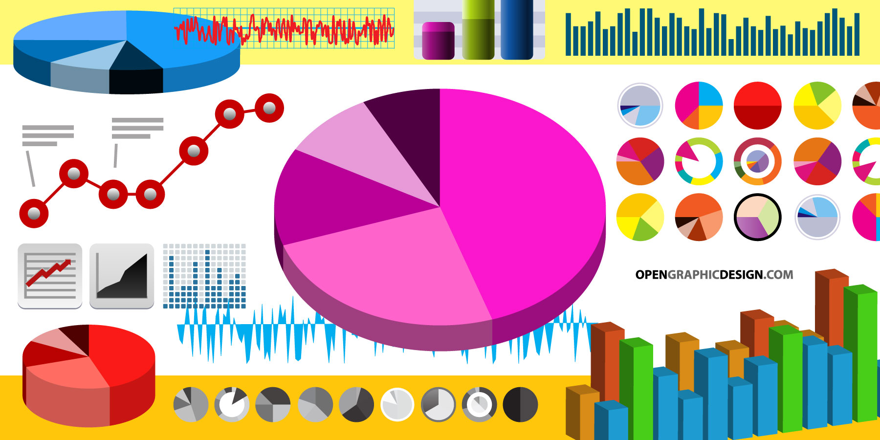
Once you have a clear educational goal it’s time to put on your archaeologist hat and discover all there is to know about your chosen subject. Compile a list of the statistics and authoritative data that you plan on using and decide where it will fit on your infographic. For example, will they be used in a timeline or flow chart, perhaps a groovy graph? Either way it’s worth using a notepad and sketching out a visual picture to help optimise your production phase. By physically assessing it in front of you, at a conceptual level, you will be able to avoid common pitfalls of over-complication and data irrelevancy.

Image Credit: Open Graphics
Customise Don’t Cannibalise:
Remember to outline your conclusion – your goal is to have a point of view; infographics are like narratives and should try to tell a story. Avoid re-treading old ground by taking the evidence you’ve gathered and layering a fresh perspective onto it. Engage your audience through compelling text so that the infographic is not only visually appealing but knowledgeable. Don’t neglect best practice guidelines, be sure to fact check every deal with multiple sources (if and when possible). You simply don’t want to end up being caught out with misinformation when it could have been taken care of, especially if your visual asset has been disseminated through shares and link building contacts.
Produce: Know Your David from Your Goliath
At the second phase you are dedicating your time to structure. This is always the most daunting period of development, but by doing a thorough job at the planning stage you will find that this is actually easier than it might seem. It all comes down to tying in your design with the question posed. Don’t over promise, even to yourself. Good infographics don’t have to be ambitious, particularly on your first attempt. If for example the subject you’re covering is about Plant life, then represent that with imagery and graphics that compliment it. This includes thinking about an overall mural background – i.e. for the Plant Life example you could use a garden or landscape as window dressing. Use google to help source imagery and clip assets. Think colour palette, what shades come to mind with plants… greens, browns, yellows? I would suggest sticking to pastels as they are less intense than stronger tones. Remember you want to catch your audiences’ attention, but they need to find the text clear and legible otherwise the retention will drop.
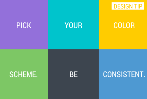
Image Credit: Wikihow
There are no standard infographic dimensions, however as peripherals are rolling out with increasingly higher resolutions I would suggest sticking to nothing less than 800px across. Height is always a tricky one and really depends on the journey you want to take your audience on. Ultimately it’s largely reliant on the sum of information being disseminated, though pollster Benjamin Travis found that 22% of vertical infographic dimensions have a height of greater than 5000px.
Tools of the Trade:
If you aren’t a graphics wiz or don’t feel confident enough to play around in Photoshop and Illustrator, then there are alternative tools to help you build a nice chart or stock-style illustration. In fact, this can be a time saving feature should you be running to a tight deadline or have multiple infographics to produce. There’s a lot of choice but Easel.ly is a fantastic free platform if you’re looking to create visual aids or structured data. Easel.ly has a remarkably user-friendly interface and allows you to upload your own images. Inforgr.am is an excellent site if you’re looking to use niche data analytics to go with over 31 dynamic chart options. Equally Visual.ly has all the aforementioned options, with the additional benefit of being able to interact with social networking data such as Facebook and Twitter.
Promote: Devotion to Your Promotion
The final phase of our three-key schedule is the promotion and marketing distribution of the finished product. Be sure that you have listed ALL of your sources within the infographic before compressing your exported file and posting it to your website or blog. Using FileOptimizer is an excellent option for compressing larger visual assets.
The most immediate and successful way to promote your infographic is to include an embed code beneath it. That way those who want to share it across the ‘digital frontier’ can easily gain access to it. In addition to this, I would unequivocally suggest you also add a “Pin It” button so that visitors can share your infographic on Pinterest. Social media is a perfect way to seed your work, particularly on Twitter. Do your keyword research to find optimal hashtags relevant to your topic. It’s even worth creating a delivery schedule so that you can reinforce your publication. Infographics are extremely link-worthy, don’t miss an opportunity to attract publishers and other business owners that might be prompted to link back to your website.
Learn by doing:
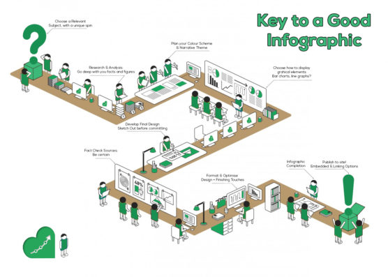
Below I have embedded an infographic demonstrating this articles topic, giving you a first-hand look at what you can achieve. It’s a simple example of compiling information using our three-key process.
Best of luck, fellow conceptualists! I hope you find this a helpful resource, and as always we welcome your own opinions and dialogue in the comments below!

